Showing posts with label abstract. Show all posts

Monday, June 13, 2016

2015-16 in review-5th grade

My Blue Art Room has had quite a hiatus! When last I blogged here I was just starting my 3rd year of teaching and beginning a new position of middle school art teacher. Now, here I am finishing my 4th year of teaching and 2nd in middle school. I'd like to get back into the habit of reflection and sharing here. Technology changes and social media changes, and I've spent much more time interacting with other art teachers on Facebook than doing the long, slow practice of writing about my work.

So, here we go.
The end of the school year is when I pass out the portfolio of work back to students and ask them what was their best piece and worst piece. It gives me an idea of which projects are worth doing again or not. My school's art curriculum is structured strongly around art history, and I try to connect with contemporary art and artists whenever possible. I've also tried to develop lessons for my middle schoolers that will have a significant level of choice and individual expression. 

5th grade
  • My museum: Our 5th graders were lucky to have the chance to visit the Barnes Foundation at the beginning of the school year. To prepare them for their trip we learned about Barnes'symmetrical ensembles, the job of a curator, and the different genre of art. They arranged their own museum galleries using printouts of some of the images from the Barnes collection, and drawing a 1 pt perspective room with museum details like lighting, signs, visitors, and guards. When complete, they critiqued them by deciding which museum they would most want to visit and why.
  • Masterpiece Mashup: Delving in further into the collections at the Barnes, my students talked about what art they liked best, and selected 2 images from postcards from the Barnes to mashup into their own unique masterpiece. Although.. it appears that this one was sparked by arms and armor and a George Segal from the PMA-my postcard collection must have been a little mixed up. hen complete, the students decided how to display their masterpieces in a Barnsian ensemble. (ps-I hate oil pastel.)
  • Hex signs: Taking one last inspiration from the Barnes, we explored hex signs. When Barnes couldn't import art from abroad during WWII he turned to local handicrafts for his collection. Since our state standards require us to introduce PA art and artists, this hex sign project was perfect. These symbols are found all over Southeastern Pennsylvania on the barns of PA Dutch farmers. My students were eager to share their experiences seeing them on trips out into Lancaster county. We were also able to learn radial design, geometric shapes, and color symbolism.

  • Self-portrait monoprints: This is one of my favorite projects in 5th grade, because printmaking is so much fun. We combined monoprinting (markers on plexiglass laid over photo printouts, traced, and printed)and texture rubbings for the backgrounds) We talk about emotional color and mood. Some students enjoy utilizing more than one of their prints to express different sides of their personality.
  • Still-life relief prints: our printmaking adventure continued with foam relief prints. I let students choose to draw their own object or use a magazine image for inspiration. They carved their foam and printed. Those who were ambitious carved for a reduction print or cut out part of the foam for a puzzle block color effect. I liked how the process allowed for differentiation. It was simple enough for my lower students with levels of progressive difficulty for my higher students. Some chose to alter their prints by coloring them with colored pencils as well.
  • National Parks landscape stamp design: I've done similar versions of this project before. Sometimes it's famous landmarks, or state symbols. In honor of the anniversary of the National Park system this year, I assigned each student a different National Park to research. We went to the computer lab and researched images of the landscape, the animals, and the plant life to use in a stamp design. This was an opportunity to connect with science and ecology, as well as with social studies and geography. One class did this project as a watercolor pencil painting, and another did it as a photoshop collage. The digital versions were much more successful and related with the concept of design.
  • Face jugs: I found an excellent video on PBS History detectives on Edgemont, SC pottery to introduce my students to the tradition of face jugs. I also shared a video read-along of the story of Dave the Potter. Our face jug project even tied back into the Barnes collection and his African Masks. (I love it when I can tie together all sorts of connections in a project!!!) I taught my students to make a pinch-pot base and coiled body for a simple pot, then scoring, slipping, smoothing clay to attach the features. This is the first time in K-8 our students get to work with real clay, since there is no kiln in our elementary building. When complete we used our jugs for a cereal or OJ breakfast and talked about what forms are better for which purpose.
  • Narrative Collage: For a literacy connection, my students learned about storytelling in art. We looked to Pieter Breughel for inspiration, then created a magazine collage with a setting, character, and action.Once complete, students chose to write a story to accompany their picture or to draw a before or after picture to show sequence, cause and effect, or problem/solution. My students really struggled with the collage aspect. I think next year I should try it as a cartooning unit instead,
  • Art History Zine: I don't get to see my 5th graders during PSSA testing due to rescheduling, so while they were with my sub I assigned each student an artist throughout at history to research. They had to find an image, 3 biographical facts, and a quote. I tried to select a range of women and men of a variety of cultures fora diverse selection. Students then drew a comic book-like bio page using their research for reference. Once I got them back I photocopied each student's page, and had them choose up to 5 pages they would like to use to make a small zine. They origami-folded each pamphlet and glued them together into a book with covers. They made a title page and book review on the covers, as a final touch. I also sent home permission slips to see if my students could have their work donated to our local zine library- the Soapbox. I created one big 20 page zine using the images they drew to donate. I liked how this project involved research, cartooning, book arts, and public art ideas.
  • My Philadelphia Story: My students were invited to participate in a public art project that will be installed at the Philadelphia International Airport. I visited the studios of Matthew Alden Price and Won Kyoung Lee to learn more about it. Then had my students draw pictures and bring objects to donate that reflected their experience of the city of Philadelphia. The Phillies, The Eagles, the Mummers, softball, skateboarding, bike life, and dance are the things my students love the best about their city.
  • My favorite genre: to conclude our study of various genre of art and techniques this year,I challenged my students to select what type of picture they preferred (portrait, still life, landscape, narrative, abstract, or public) and the 2D medium they preferred (pencil, marker, paint, pastel) to create a final personal work of art. This one started as a still-life of a duck decoy, but then he added the pond and reflection around it. I was so proud of my students and their engagement in this final project. Many reported this as being their favorite project because they really felt like artists making decisions.
I'm pleased with how the 5th grade curriculum has developed. I understand the big picture and purpose of how the projects to together and use an essential question to drive the learning. I believe we will continue to work with these themes next year. I would like to do more observational drawing practice with next year's 5th graders to bridge the awkward middle school belief in drawing ability. They don't THINK they know how to draw. They need more opportunities to try. I've shared 10 of the 13 projects we did together in 5th grade this year. Two years ago I lamented how little work we'd accomplished in one year. In comparison, this year 5th grade art was a brilliant success!


Saturday, October 4, 2014

One month in

So...Middle School rocks!
I am so happy in my new position. I have ENOUGH planning time to ACTUALLY DO MY JOB. This is huge, because in past years I had very little prep time and was staying after school for at least an hour or more every day to catch up on grading, photographing work for artsonia, and hanging work in the halls. I've even, for the most part, had enough time to write my lesson plans while at school instead of bringing them home over the weekend. I'm happy and my family is happy because they actually get to see me and I'm not super stressed out all the time.

Middle Schoolers are funnyyyyyyyy. I love my kids and their questions and stories and jokes, and generally behavior has been pretty good. I've only given one demerit so far, and had to yell only 2-3 times. I haven't cried out of frustration or exhaustion. I've laughed a lot and worked through some difficult behaviors with a good sense of humor.

Also in middle school, I can expect them to do a lot more with writing, vocabulary, and image analysis. We've got a routine going called "Quiet 5", where they come in, get their sketchbooks, and immediately get started on a quick warm-up activity. It's really helped with behavior and learning concepts. Just hearing me say something does not instill it in their brains. But writing things down, and drawing examples is working, and I can tell because of the quality of their written reflections at the end of projects.
Here's a glimpse of what's been happening in My Blue Art Room (which isn't blue anymore, but whatever, it's lilac now but I'm not changing the title of my blog, so plbbbt!):
My 5th graders made a name collage ala Ellsworth Kelly by collaging the letters of their name, measuring a grid, cutting the pieces apart, then puzzling and collaging them back together in a random way. They learned about contrasting and complementary colors, We also talked about emphasis. Not everybody got that, but the student who made the one above did! She added the black diamond to make her letters feel pulled into the center. I took all the squares from a class and combined them into collaborative displays like the one below:
 My 6th graders learned about radial symmetry and created these name mandalas. They first drew their name to fill a tissue paper square, then repeated it in all 4 corners. They also learned about analogous colors and selected a limited palette for their designs. I have them arranged in the hall to flow through the colorwheel.
 I haven't photographed any 7th grade projects yet, but we're doing 1 point perspective with their names. And 8th grade is reviewing the elements of art and using the letters of their names in a Calder-inspired stabile sculpture.
Here's a glimpse of what's coming down the pipeline: 5th grade colorwheel paintings, the grade 2 -pt perspective lego paintings, and 8th grade fake advertisements. Did I mention I actually have time to do things like make new exemplars?!!
And my favorite part is when my 8th grade portfolio prep group comes to visit me at lunchtime twice a week! We are currently doing pencil drawings of still-life objects. This crew is planning on applying to the Creative and Performing Arts High School which requires a portfolio audition, and I'm trying to give them time to prepare. They have to be done by  December, which will be here before we know it.
I miss my little guys at the elementary school, but so far so good with middle school kids. (as long as I can manage to keep a straight face)

Friday, November 15, 2013

5th grader Abstract Me

 You know those projects you think are going to be really quick and easy? And then they're not. Well, it's partly my own fault because I've been trying to build sketchbook work and extra skills into my 5th grade lessons. Only problem with that is then projects take forever. This looks pretty simple, but students did measuring and compass use practice before drawing their compositions.
 They did a written brainstorm to develop text to put into their artwork and practiced some different letter styles.
 They did a color wheel exercise and chose analogous color harmonies for their paintings.
 And of course, there was the drawing, sharpie outlining, and painting.
 Kids were very invested, despite the lengthy process, because these explored their favorite subject matter- themselves! It was also low-risk art skills-wise as using ruler and compass helped them make bold abstract compositions, and using analogous colors minimized muddy painting.
 I highly recommend this kind of art project for middle school and up. Most of my 5th grade curriculum centers on self-expression in some form or other. As pre-teens, they are trying to figure themselves out and developing their personalities. Art can be a great catalyst for helping them emerge as adolescents, and it is crucial that their fragile egos are supported.
 This kind of project also reveals a great deal about students. They discover they have things in common, and it gives insight into their interests. These can then be mined for future projects.
 I find it curious how some went more curvilinear and other more geometric. Some are bold, others are quiet.
Now if I can only get them to stop being so chatty and get some work done!

Saturday, November 9, 2013

2nd grade abstractions

My second graders loved getting to use compass and rulers to draw shapes for their abstract drawing. We reviewed geometric and organic shapes and practiced drawing them. Then students were asked to use 4 geometric and 3 organic shapes to make a composition, allowing some to overlap, playing with scale, and making sure there were no empty areas leftover.
 Then they got to use oil pastels to fill in their shapes. When shapes overlapped they had to make a choice- to blend for a transparent shape or not to keep shapes opaque. They also were encouraged to make some tints by blending white on top. They love seeing what happens when colors blend together
 It's a real challenge to students' persistence trying to blend oil pastels on a 12x18 sheet of paper. I kep encouraging them to keep going back and make their color look smooth.
 We looked at Kandinsky for some inspiration (of course). We talked a bit about how in abstraction sometimes our brains make us see real things even if the artist didn't intend to draw or paint them that way. Some kids made more face-like images (and I have one absolute pumpkin: hello pre-Halloween project!) I like the one random fish in the picture below:
 The awesome part of this project is how easy it is to make an interesting composition of random shapes and colors. Kids aren't caught up in what it looks like, and they are confident about their results. I hope they can hold on to that feeling as we move forward.
 There were some interesting adaptations that came up as my special needs kids worked. One boy got very caught up in the oil pastel texture and would color thickly, then scratch away at the surface. He might have been better off using crayons. Another boy got distracted by all the shapes and kept getting stuck- so I brought over a scrap paper to cover most of his composition, outlined a single shape in the same color he'd started with and then he was able to focus on coloring shape by shape.
We held off using black pastels til the very end to prevent smudging. I asked kids to outline the shapes that they wanted to stand out to add emphasis. We compared emphasis in a picture with an exclamation point on a sentence. It was interesting to see what they chose to emphasize. For several students, before they handed it in as complete I held their picture back for them to see and check if anything was missing or needed more emphasis. I'm fascinated with how kids seem to have an intuitive sense of visual balance. They nearly always pointed out the same place I would have told them to add to. This project is a legacy from the former art teacher at the school. Why mess with a winner?

Saturday, March 2, 2013

5th grade Value and Unity

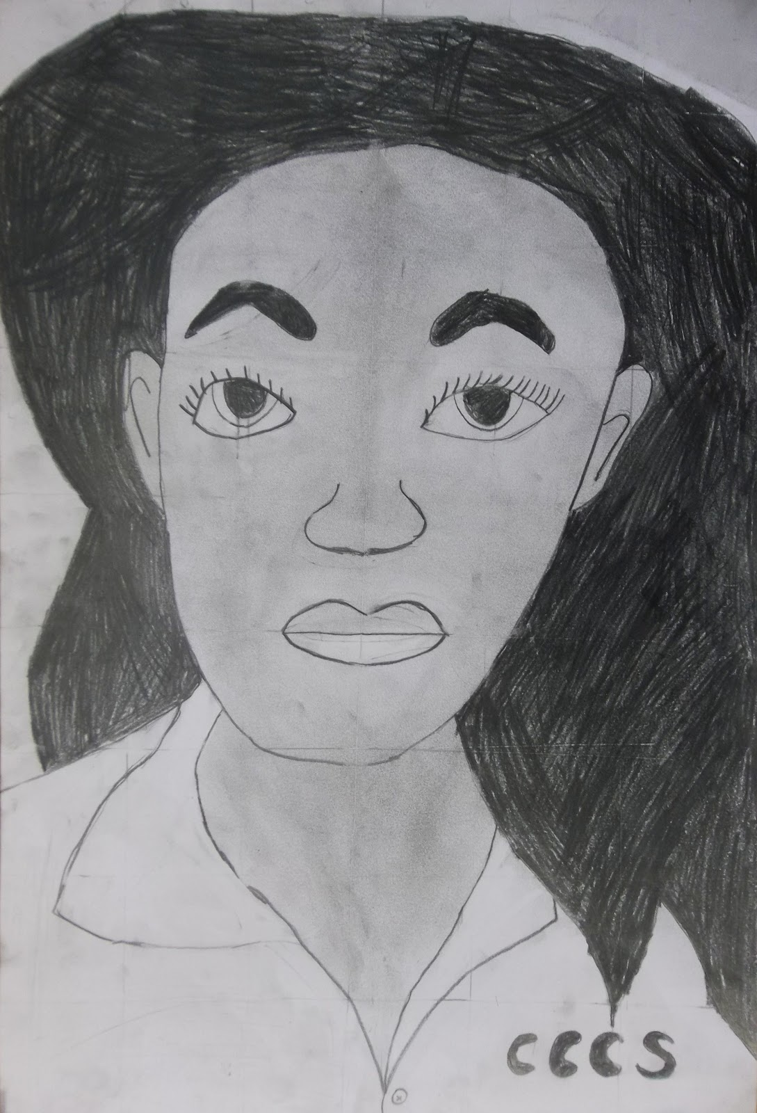
 Hallelujah! The 5th graders have completed their grid portraits!! It was a feat, getting through measuring grids on our photos and project papers, and figuring out how to match box for box. Some struggled through the whole thing, but others really focused and persevered to create some impressively realistic portraits. I think 5th grade is the earliest age that can handle this kind of project- I usually see this process used at the middle and high school levels. So considering the developmental challenges of this project, our success rate was quite good.
 They didn't come out quite how I expected, because once they were done shading their faces and erasing all the grid lines, there was a desire to change the background somehow. Some students simply cut out their portrait and glued it down to a colored piece of paper. Others decided to add a background in colored pencil or crayon. While these additions seem juvenile in comparison to their skilled portraits, I think the combination reveals their confused position between childhood and adolescence.
 These background additions also show some more personality, and provided more choice options to how the final piece looked. Speaking of choice, students had lots of options. They could copy the photo, enlarge the photo, distort their image by using a wavy lined grid, or start with a collaged section of their photo to extend and complete it. Whereas the images above are all 9x12, the drawing below is 12x18. Very few students chose the distortion option. Finally I asked them if they would want to have their self-portrait on display or not. I know how self-conscious this age group can be, both about their bodies and their skills, making this a doubly potentially embarrassing project to have on display. Strangely, some of the best portraits were ones I was asked NOT to display. Maybe they don't want to show off either.
 As students completed their portraits at different rates I had another simple project waiting in the wings. A recent visit for a meeting with fellow art teachers at Tyler yielded a stack of waste lithograph prints that the print department was getting rid of. I thought we'd use the grid concept one more time for assembling an image. I cut the prints into 2 inch squares, which disrupted any realism and left only interesting patterns, values, and lines.
 I asked students to select 9 squares and puzzle them together to create a new image- making sure that no two squares that were originally together remained together (we were not trying to reconstruct the old image, but create a new one). Next students paired up to share their collages and brainstorm ways that their pictures could be more unified. I asked them to use black and colored sharpies to connect and unify the squares in order to lose the grid. They had to extend the lines, patterns, and values across the squares to blend them together.
 At the end of class we brought all our collages up (some students made more than one) and they students pointed out which ones felt the most unified or complete as a single image. I was very pleasantly surprised at how much students enjoyed this exercise. Even my students who often seem the most demanding and helpless worked independently and successfully on this project. I believe it was because they had to be choicemakers more than imagemakers for this project. It was an exercise in aesthetics really, with only a little bit of added embellishment.
 My students seem quite comfortable with abstract imagery. Even the Kindergartners and first graders understand the artistic possibilities of line, shape, and color. Realism seems to cause anxiety in the art room. I think this project could also work successfully with magazine collage squares in color instead of the black and white prints.
Next up I think we're going to do some compositional work in 5th grade, cropping a resource image to find a new composition.