Wednesday, March 27, 2013

5th grade positive/negative bicycles

Way back in September I saw this project over on Mrs. Knight's Smartest Artists and it's been stewing in the back of my memory all year. Since my 5th graders finally finished up their portraits and were familiar with the enlarging process, I thought they could handle this bicycle composition project.
 We started looking at artists who have depicted or used bicycles in their work- like Duchamp and Ai WeiWei to think about what bicycles represent (freedom, youth, speed, independence, "green" transportation, etc.). The noted how bicycles create very interesting positive and negative space thanks to their interesting forms and construction. Students selected a copy of a bicycle photograph to work from and then cropped it down so that at least one part of the bicycle was touching 2 edges of the paper. Most of the students selected the wheel for their compositions, but the most successful compositions were those that focused on the gears and frame. After cropping they were left with images about 3x4 inches and they had to enlarge their pictures and draw them on a 12x 18 inch paper.
 Once their drawings were complete, they painted the positive bicycle shapes in black tempera, trying to make a bold, graphic effect with smooth edges to the lines and shapes.
 Finally we reviewed color harmonies, and students selected either monochrome, complements, or analogous colors to paint their negative spaces in watercolor. Analogous harmonies were the most popular- especially blue/purple/red for some reason!
We finished these up just in time for the end of the marking period! I'm debating about what to next with them. I want to display these in a way that makes connections from picture to picture, and it might be fun to have them decide how they should be arranged. Understanding the importance of exhibition is a part of the state standards, and making them decide how to display it would be an interesting collaborative process. The challenge is just to do it in a way that involves all students.

Update: So, faced with the reality of how few weeks are left I couldn't bear to lose time on an activity that might not be totally successful. I found a happy medium to my display problem by pulling a student helper out from the class to help hang the work and make choices on the arrangements. I've gotten sooo many compliments from the teachers and students on how great this project was. Here's the display:

Friday, March 15, 2013

2nd grade Oaxacan-inspired sculptures

At the beginning of the school year as I unpacked all the goodies in my new art room I could not BELIEVE how many boxes of wood shapes I found, both left over from the previous year and on my hand-me-down supply list from the previous art teacher. I couldn't imagine how so much wood could possibly be used in one year. I put a dent in the boxes with a mobile project I did with 2nd grade early in the year, but now we've nearly demolished the wood supply with our latest project: Oaxacan-inspired wood animal sculptures.
 It's so hard to choose photos to share, because their sculptures all have so much character. We started off by examining examples of Oaxacan wood sculptures- especially how the forms, colors, and markings of the animals were exaggerated from real life. We considered adaptations an animal needs to live in an environment and selected features from known animals to create an imaginary animal. Students drew a sketch of what animal they would like to create to finish off the first art-looking and art-planning day.
 On the second day, we pulled out the wooden shapes and noticed their forms- most of which were in the cylindrical or rectangular prism category. I asked students to pull out pieces and play with the arrangement of forms a bit before deciding how to construct their animal. They were also asked to pay attention to how their pieces connected- the more surface area touching between 2 pieces, the stronger the attachment would be. We used tacky glue for this step because I shouldn't find where I hid the wood glue!
 On the third day I asked students to choose 1-2 colors to paint a base coat on their sculpture. After 3 classes of messily painted sculptures, I limited the 4th class to ONE base color! On the fourth day we looked at the Oaxacan sculptures one more time to remember how they were decorated. This time we used skinny brushes and added pattern details like stripes and polka dots. We thought about how some animals try to blend in to their environments with camouflage colors and some animals have warning colors to show they are poisonous.
On our final work day, students had an opportunity to add some final details with feathers, beads, googly eyes, and sequins. They were asked to be RESTRAINED in their choices and not go overboard with the doodads. They also created a written description and a drawing of their animal in its environment to serve as a label for their sculpture when they go on display. Their written description had to include what animals they combined, three things their sculpture had, and explain how their sculpture was or was not like Oaxacan sculptures
This project is a real winner- students got to work in 3 dimensions and use a lot of creative problem-solving as well as connect to concepts in science.  The process and product are nicely balanced, and the final pieces are amazing!
 PS. For good photos of sculptures, hang a piece of black construction paper so it is half on the wall, half on the table and place the sculpture on top.

Saturday, March 2, 2013

5th grade Value and Unity

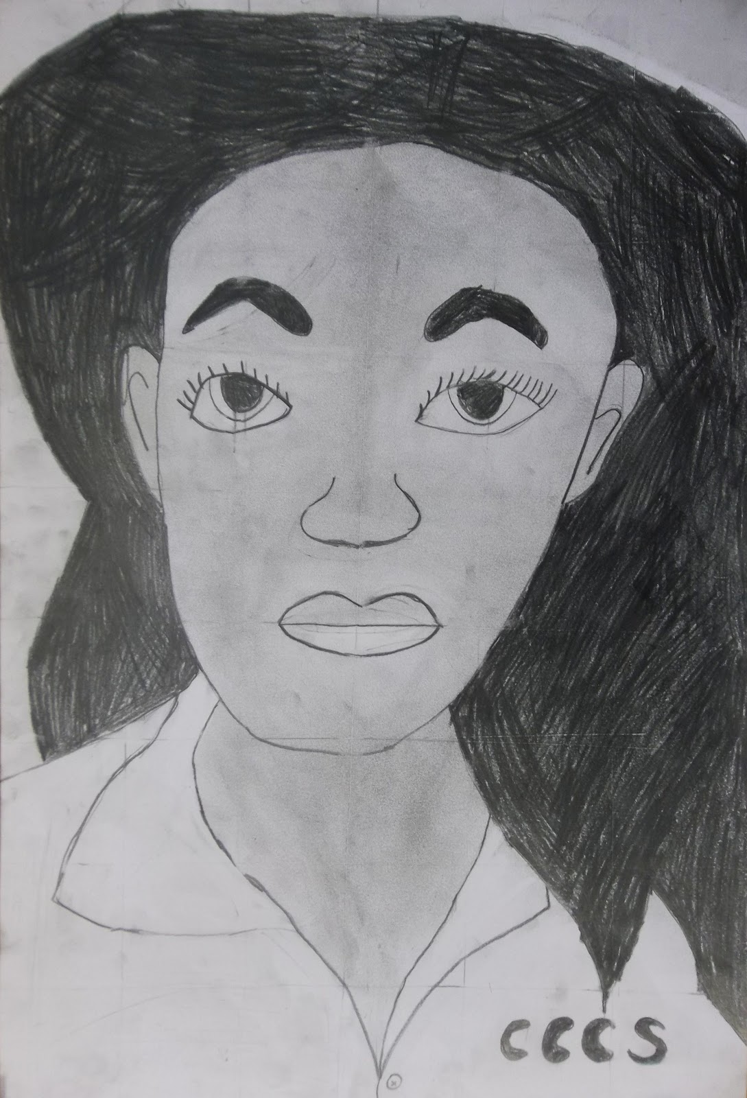
 Hallelujah! The 5th graders have completed their grid portraits!! It was a feat, getting through measuring grids on our photos and project papers, and figuring out how to match box for box. Some struggled through the whole thing, but others really focused and persevered to create some impressively realistic portraits. I think 5th grade is the earliest age that can handle this kind of project- I usually see this process used at the middle and high school levels. So considering the developmental challenges of this project, our success rate was quite good.
 They didn't come out quite how I expected, because once they were done shading their faces and erasing all the grid lines, there was a desire to change the background somehow. Some students simply cut out their portrait and glued it down to a colored piece of paper. Others decided to add a background in colored pencil or crayon. While these additions seem juvenile in comparison to their skilled portraits, I think the combination reveals their confused position between childhood and adolescence.
 These background additions also show some more personality, and provided more choice options to how the final piece looked. Speaking of choice, students had lots of options. They could copy the photo, enlarge the photo, distort their image by using a wavy lined grid, or start with a collaged section of their photo to extend and complete it. Whereas the images above are all 9x12, the drawing below is 12x18. Very few students chose the distortion option. Finally I asked them if they would want to have their self-portrait on display or not. I know how self-conscious this age group can be, both about their bodies and their skills, making this a doubly potentially embarrassing project to have on display. Strangely, some of the best portraits were ones I was asked NOT to display. Maybe they don't want to show off either.
 As students completed their portraits at different rates I had another simple project waiting in the wings. A recent visit for a meeting with fellow art teachers at Tyler yielded a stack of waste lithograph prints that the print department was getting rid of. I thought we'd use the grid concept one more time for assembling an image. I cut the prints into 2 inch squares, which disrupted any realism and left only interesting patterns, values, and lines.
 I asked students to select 9 squares and puzzle them together to create a new image- making sure that no two squares that were originally together remained together (we were not trying to reconstruct the old image, but create a new one). Next students paired up to share their collages and brainstorm ways that their pictures could be more unified. I asked them to use black and colored sharpies to connect and unify the squares in order to lose the grid. They had to extend the lines, patterns, and values across the squares to blend them together.
 At the end of class we brought all our collages up (some students made more than one) and they students pointed out which ones felt the most unified or complete as a single image. I was very pleasantly surprised at how much students enjoyed this exercise. Even my students who often seem the most demanding and helpless worked independently and successfully on this project. I believe it was because they had to be choicemakers more than imagemakers for this project. It was an exercise in aesthetics really, with only a little bit of added embellishment.
 My students seem quite comfortable with abstract imagery. Even the Kindergartners and first graders understand the artistic possibilities of line, shape, and color. Realism seems to cause anxiety in the art room. I think this project could also work successfully with magazine collage squares in color instead of the black and white prints.
Next up I think we're going to do some compositional work in 5th grade, cropping a resource image to find a new composition.

Saturday, February 23, 2013

3rd grade Pop-up Landscapes

3rd grade has just completed their landscape genre project which focused on background, middleground, and foreground. To make understanding of the different spaces very literal, I thought it would be fun to physically separate them and make a pop-up landscape. We started with a map to cover a foundation piece of chipboard, and used the roads and boundaries within the map to inspire a horizon line for the background of a landscape. Students then created a middleground layer from construction paper, and then foreground elements. To emphasize a sense of space, students were encouraged to draw things tiny in the background and large in the foreground. They were also challenged to make something happen in their landscapes like Grant Wood did in "The Midnight Ride of Paul Revere", one of the paintings we looked at for inspiration.
 We had a paper spring folding contest before assembling the layers. Photos don't really do justice to these pieces, because it flattens them out. In reality, these images really pop-out, and the small foreground pieces even quiver in the air currents or when jostled. Students had a choice of what kind of landscape to create. My original example showed a mountainscape, and so it was a popular choice. Although the range of animals included bears, rabbits, wolves, squirrels, and even monkeys.
 Seascapes were another very popular choice- probably because many of my students enjoy going down to the Jersey shore in the summer, and it's familiar. I can just imagine Ocean City in the boardwalk scene below, which includes a ferris wheel and cotton candy vendor. 
Another favorite landscape was the EXPLODING VOLCANO. About half my boys did a version like this, many of which included screaming villagers fleeing from the lava. (Could it be that they remember my Pompeii story from when we did mosaics? Dream on Art teacher)

At the end of the lesson I gave students a sheet of lined paper and some sentence starters on the board so that they could write a description. They had to give a big idea sentence: "My picture is about...." . Then supporting detail sentences: "In the background,....", "In the middleground,...", and "In the foreground,..." Finally they could conclude with an opinion about the project: "I thought this project....."
After writing, they glued the papers to the back of the project. I really like having them write about their work. It gives them extra writing practice and an opportunity to express themselves in multiple ways. Although they groan and protest ("But this is ART class!"), I tell them artists have to write ALL THE TIME and to get used to it. It was also one more way for me to assess their understanding of the key concepts of space and landscape. This lesson is definitely a keeper- all the other classes in higher and lower grades kept asking when they would get to do it!

Friday, February 22, 2013

1st grade bouquets

My first graders have just finished some beautiful still-life bouquets. We started by looking at a sunflower still-life by Vincent Van Gogh, but noted that it was a little plain looking- the colors were all similar, the vase was simple, and the background was very plain. I thought it would be more fun to add pattern to our still-life project.
 We started by making a symmetrical vase. Students chose either orange or yellow construction paper, folded it in half "hotdog style", and drew a wavy line that started and ended on the fold. After cutting it out they opened it up and discovered some very interesting shapes. It's fun to see how different all the vases turned out! I told the kids to pretend they were potters who had to glaze their vase, and they added lots of colors and patterns in crayon.
 Next we made our table and wallpaper backgrounds. We looked at the wood grain on our classroom tables and tried to copy the swirls and knots of the wood. Some students chose to make a tablecloth pattern instead. When the background was finished, we glued the vases down, trying to leave enough room for the bouquet. Guess what? Glue stick doesn't really stick to crayon! After my first class glue stick failure, the others used elmers and dot,dot, not alotted. Some interesting composition problems occurred along the way. One student, below, had drawn a table with the paper in horizontal format, but had a super tall vase. So she cut it in half and had 2 bowls instead!
 Finally, it was time to print our flowers. We used large and small wooden spools as stamps with red and yellow tempera paint. It's interesting to see how different their flowers all look depending on how they printed the flowers. Some look more like daisies, others like hydrangea. Some just made on flower per stem they drew, others made a cloud of flowers.
I'm really pleased with how these turned out. Even though this project seemed very straightforward, it still lots of little opportunities for students to make artistic choices. It also had a lot of review of art element concepts from the beginning of the year (line type, pattern, primary colors, cutting and gluing technique).

Next up we're having a review of genres. We've done a landscape, a portrait, and a still-life, and so as a review we're going to do a collaborative "1st grade museum".


Tuesday, February 12, 2013

Sounds of music in Artclub

I'm so excited about my new art club group. This was our 3rd week, and our first project is in full swing. After learning a thing or two with my first group in the Fall, I decided to make our sessions more structured. We have snack, and then there is a sketchbook challenge for the kids to do while they wait for everyone to finish or for me to get things set up. The sketchbooks were made in our first class and the kids can add any additional drawings or writings they wish. We also made a list of themes to explore in artclub, and the first one they chose was music. Simple changes like this ( more structure and theme-exploration instead of material exploration), not to mention a calmer, more focused group, have changed my whole feeling about Tuesdays.
Each child selected a favorite instrument to draw as a big poster. We found google images of the instruments for inspiration and cheated by projecting and tracing the outlines (Is it cheating or using a tool?). We played with scale and composition so that even if 2 students shared an image they would still look different. Then they traced over their lines with sharpie so that when we paint they don't lose their drawing. I challenged them to add something to the background to represent sound- of course most of them chose music notes. Since our papers are so big, only 2 people could really work at a table at a time comfortably, so we sprawled out around the floor on carpets. I love how relaxed and true-art studio the room felt when they did this. Working in my little room with just 15 kids is sooooo nice.

Saturday, February 2, 2013

4th grade shell variety

The 4th graders tried out their observational skills and learned about variety in this shell-drawing project. Students had to do 3 versions a contour line drawing, a value-shaded drawing, and a color drawing in colored pencil. The great thing about the shells is that they hold the kids' interest and curiosity longer than a bottle would have, and the irregular shapes of the shells were very forgiving to those whose drawing skills were not very developed.
 It's very interesting to see from the pictures who REALLY LOOKED at their shells and who just drew from imagination.
 I was also impressed with how many kids based their drawings off of the ellipse-sketching style they had used in their previous project. (Hey! They learned and remembered something!!)
 At the end of the project I had the kids write about which style was their favorite. The overwhelming response was COLOR because it made the drawing "pop out".
 Only a few chose value or contour. My very favorite of all is this sweetly simple spiral of a shell with some  speckles and stripes. It is so sensitively drawn:
I'm proud of my fourth graders for willingly trying to see and draw in some different ways. It was wonderful to talk with them individually, point out details, and help them SEE. It's about seeing more than about drawing. I saw lots of little light bulbs go off in their heads. I hope they're ready for their next challenge: we're entering the National Wildlife Refuge Jr. duck stamp contest!