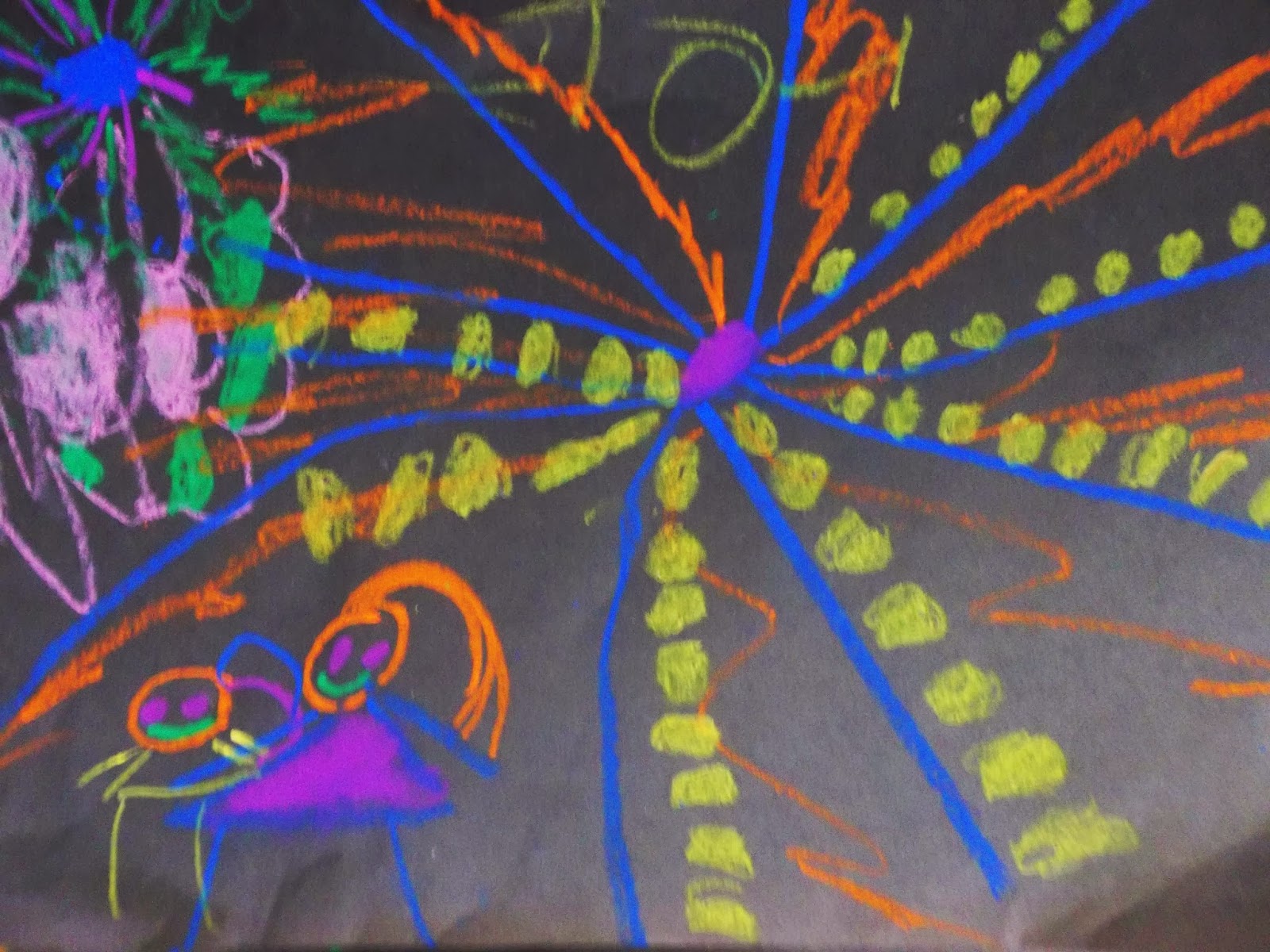
I went back to school on Tuesday after an extra long Winter break (so great when Christmas is on a Wednesday!). Of course, we're suffering through the coldest weather I've ever known in my entire life... about 1/5 of our students were absent yesterday!
With my remaining Kindergartners, we looked at the Firework art of Cai Guo-Qiang as well as some fireworks photographs I'd taken on New Year's Eve.We talked about the sounds, sizes, and colors of fireworks and even watched a short video of fireworks in reverse!
We made hand motions to mimic the sound and expansion of a firework explosion, clap...and going out from the center in a radial motion.
We used oil pastel on black paper, noting that you can't really see fireworks if they go off during the daytime. As students finished up I asked them to count how many they had drawn and to notice if they were big or small.
At the end of class, each table group got to come up and make a fireworks show saying "POP!" for their small ones and "BOOM!" for their big ones. I really love this project... it's quick, fun, related to student experience, kinetic, auditory... the best!
I have to share this construction by one of my 4th grade boys. He had finished his stained glass project early, and had time for free choice (a 4th grade rarity). It seems appropriate for this Happy New Year post as it's an awesome Chinese-inspired dragon. I loved how he surrounded it with water diamonds.
I hope the rest of the school year continues as easily as the beginning has been. Happy New Year, everybody! Have a creative year blessed with highly engaged and well-behaved students! (We can dream, right?)
Showing posts with label lines. Show all posts
Wednesday, January 8, 2014
Wednesday, November 6, 2013
Speedy 3rd graders
I might chalk this one up as BEST PROJECT EVER. We compared 2 abstract paintings (both entitled "SPEED" to identify ways artists create movement with line and direction. Then we brainstormed "FAST" things. Students had to draw, cut out, and glue down a fast object in silhouette, and then use line variety to create a sense of movement across the page. We compared the idea to the contrail a plane makes as it crosses the sky.
We had lots of birds (like my exemplar), many rockets, some vehicles like cars and jet skis, some fish and lions, and even a tornado or two!
Best of all, we managed to get through a lesson from intro to completed project in one class period, and it reinforced the line quality we'd just completed studying while introducing movement. No, BEST of all was how super engaged everybody was. The brainstorm of FAST things helped everybody find an idea, and it had plenty of room for creative interpretation. The only trouble was with 2 or 3 kids who weren't confident in being able to draw or cut out their objects.
I love how exciting these look! I asked kids to just write me a note about what they made (in case I couldn't tell a bird from a plane). The surprise ending was seeing how many kids wrote more than a note, since they are getting used to the expectation of writing about their art. WIN!
We had lots of birds (like my exemplar), many rockets, some vehicles like cars and jet skis, some fish and lions, and even a tornado or two!
Best of all, we managed to get through a lesson from intro to completed project in one class period, and it reinforced the line quality we'd just completed studying while introducing movement. No, BEST of all was how super engaged everybody was. The brainstorm of FAST things helped everybody find an idea, and it had plenty of room for creative interpretation. The only trouble was with 2 or 3 kids who weren't confident in being able to draw or cut out their objects.
I love how exciting these look! I asked kids to just write me a note about what they made (in case I couldn't tell a bird from a plane). The surprise ending was seeing how many kids wrote more than a note, since they are getting used to the expectation of writing about their art. WIN!
Wednesday, October 16, 2013
The Elements of Art according to 4th grade
Last year I had 4th grade do a hidden name project with lines, colors, and patterns. It took way too long due to using colored pencils and 12x18 paper. So I decided to revamp the project. It's still a hidden word (possibly a name) but this time with an emphasis on the elements of art.
Students studies the elements through examples on my bulletin board and also through videos on "The Artist's Toolkit". They wrote a short word (name, favorite activity, or some onomatopoeia), then divided the space into 6 sections. Each section was supposed to illustrate or emphasize a different element of art (Line, color, shape, value,pattern, shape).We used marker, crayon, or colored pencil on 9x12 paper. Was the project any shorter? NO!!! ARGHH!! I think it's just 4th grade. They're either too chatty and distracted, or on the flip side they're too detailed and slow. I need balance!
For the most part, they finally got it and the resulting abstract works are visually exciting. We've moved on to OP ART, and the kids are loving it.
Wednesday, March 27, 2013
5th grade positive/negative bicycles
Way back in September I saw this project over on Mrs. Knight's Smartest Artists and it's been stewing in the back of my memory all year. Since my 5th graders finally finished up their portraits and were familiar with the enlarging process, I thought they could handle this bicycle composition project.
We started looking at artists who have depicted or used bicycles in their work- like Duchamp and Ai WeiWei to think about what bicycles represent (freedom, youth, speed, independence, "green" transportation, etc.). The noted how bicycles create very interesting positive and negative space thanks to their interesting forms and construction. Students selected a copy of a bicycle photograph to work from and then cropped it down so that at least one part of the bicycle was touching 2 edges of the paper. Most of the students selected the wheel for their compositions, but the most successful compositions were those that focused on the gears and frame. After cropping they were left with images about 3x4 inches and they had to enlarge their pictures and draw them on a 12x 18 inch paper.Once their drawings were complete, they painted the positive bicycle shapes in black tempera, trying to make a bold, graphic effect with smooth edges to the lines and shapes.
Finally we reviewed color harmonies, and students selected either monochrome, complements, or analogous colors to paint their negative spaces in watercolor. Analogous harmonies were the most popular- especially blue/purple/red for some reason!
We finished these up just in time for the end of the marking period! I'm debating about what to next with them. I want to display these in a way that makes connections from picture to picture, and it might be fun to have them decide how they should be arranged. Understanding the importance of exhibition is a part of the state standards, and making them decide how to display it would be an interesting collaborative process. The challenge is just to do it in a way that involves all students.
Update: So, faced with the reality of how few weeks are left I couldn't bear to lose time on an activity that might not be totally successful. I found a happy medium to my display problem by pulling a student helper out from the class to help hang the work and make choices on the arrangements. I've gotten sooo many compliments from the teachers and students on how great this project was. Here's the display:
Friday, February 22, 2013
1st grade bouquets
My first graders have just finished some beautiful still-life bouquets. We started by looking at a sunflower still-life by Vincent Van Gogh, but noted that it was a little plain looking- the colors were all similar, the vase was simple, and the background was very plain. I thought it would be more fun to add pattern to our still-life project.
We started by making a symmetrical vase. Students chose either orange or yellow construction paper, folded it in half "hotdog style", and drew a wavy line that started and ended on the fold. After cutting it out they opened it up and discovered some very interesting shapes. It's fun to see how different all the vases turned out! I told the kids to pretend they were potters who had to glaze their vase, and they added lots of colors and patterns in crayon.Next we made our table and wallpaper backgrounds. We looked at the wood grain on our classroom tables and tried to copy the swirls and knots of the wood. Some students chose to make a tablecloth pattern instead. When the background was finished, we glued the vases down, trying to leave enough room for the bouquet. Guess what? Glue stick doesn't really stick to crayon! After my first class glue stick failure, the others used elmers and dot,dot, not alotted. Some interesting composition problems occurred along the way. One student, below, had drawn a table with the paper in horizontal format, but had a super tall vase. So she cut it in half and had 2 bowls instead!
Finally, it was time to print our flowers. We used large and small wooden spools as stamps with red and yellow tempera paint. It's interesting to see how different their flowers all look depending on how they printed the flowers. Some look more like daisies, others like hydrangea. Some just made on flower per stem they drew, others made a cloud of flowers.
I'm really pleased with how these turned out. Even though this project seemed very straightforward, it still lots of little opportunities for students to make artistic choices. It also had a lot of review of art element concepts from the beginning of the year (line type, pattern, primary colors, cutting and gluing technique).
Next up we're having a review of genres. We've done a landscape, a portrait, and a still-life, and so as a review we're going to do a collaborative "1st grade museum".
Labels:
1st,
color,
crayons,
lines,
pattern,
printmaking,
still-life
Saturday, February 2, 2013
4th grade shell variety
The 4th graders tried out their observational skills and learned about variety in this shell-drawing project. Students had to do 3 versions a contour line drawing, a value-shaded drawing, and a color drawing in colored pencil. The great thing about the shells is that they hold the kids' interest and curiosity longer than a bottle would have, and the irregular shapes of the shells were very forgiving to those whose drawing skills were not very developed.
It's very interesting to see from the pictures who REALLY LOOKED at their shells and who just drew from imagination.I was also impressed with how many kids based their drawings off of the ellipse-sketching style they had used in their previous project. (Hey! They learned and remembered something!!)
At the end of the project I had the kids write about which style was their favorite. The overwhelming response was COLOR because it made the drawing "pop out".
Only a few chose value or contour. My very favorite of all is this sweetly simple spiral of a shell with some speckles and stripes. It is so sensitively drawn:
I'm proud of my fourth graders for willingly trying to see and draw in some different ways. It was wonderful to talk with them individually, point out details, and help them SEE. It's about seeing more than about drawing. I saw lots of little light bulbs go off in their heads. I hope they're ready for their next challenge: we're entering the National Wildlife Refuge Jr. duck stamp contest!
Labels:
4th,
color,
colored pencil,
drawing,
lines,
still-life
Wednesday, January 9, 2013
Happy New Year!
We've been back to school for a week, and the kids are getting settled back into routine. Since we only had 2 days last week I did a quick project with the Kinder and first grade classes I saw so that I could get the entire grades back onto the same project this week. We shared some of the "exciting" things we'd seen over vacation, which in my area means MUMMER PARADE (you wouldn't believe how many of my students and their families were in the brigades). However, I was thinking about New Year's Eve fireworks which I watched from my back steps.
I showed the classes a video of a fireworks show and the kids noticed that fireworks are colorful, have straight, curved, and dotted lines that shoot out from the center, and are different sizes. With the fresh vision in their minds, students used construction paper crayons on black paper to fill their page with fireworks. At the end of class we circled up for a "Fireworks Show", and I let the kids take turns making a sound effect for their picture as they showed it off. It was a very fun lesson that helped my little ones review types of lines.
My resolution this year is to stay organized, get through grading, photographing, "Artsonia'ing", and displaying kids projects in a timely manner, and make my lesson directions easy to follow. Even though we're not technically at the halfway mark, the Winter break FEELS like halfway through the year. Hopefully the second half gets even better.
Friday, October 26, 2012
Dot, Dot...
My first graders have just finished a mixed media sea life scene that focused on types of lines. They drew a sea creature, filling it with lots of different lines. Then they made paste paper and dragged combs through it to texturize the background. Finally they collaged all the bits together to make their sea creature hide among some seaweed.
The funniest part of my week happened as they were gluing their collages together. I had taught them the "dot, dot, not a lot" saying to prevent them from making glue puddles on their papers. In the middle of class they all started chanting quietly in unison, "Dot, dot, not a lot... dot, dot, not a lot....dot, dot, not a lot!" And I totally cracked up!
Their collages look great and all very different. These 2 were my favorites!
Subscribe to:
Posts (Atom)