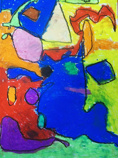
My second graders loved getting to use compass and rulers to draw shapes for their abstract drawing. We reviewed geometric and organic shapes and practiced drawing them. Then students were asked to use 4 geometric and 3 organic shapes to make a composition, allowing some to overlap, playing with scale, and making sure there were no empty areas leftover.
Then they got to use oil pastels to fill in their shapes. When shapes overlapped they had to make a choice- to blend for a transparent shape or not to keep shapes opaque. They also were encouraged to make some tints by blending white on top. They love seeing what happens when colors blend togetherIt's a real challenge to students' persistence trying to blend oil pastels on a 12x18 sheet of paper. I kep encouraging them to keep going back and make their color look smooth.
We looked at Kandinsky for some inspiration (of course). We talked a bit about how in abstraction sometimes our brains make us see real things even if the artist didn't intend to draw or paint them that way. Some kids made more face-like images (and I have one absolute pumpkin: hello pre-Halloween project!) I like the one random fish in the picture below:
The awesome part of this project is how easy it is to make an interesting composition of random shapes and colors. Kids aren't caught up in what it looks like, and they are confident about their results. I hope they can hold on to that feeling as we move forward.
There were some interesting adaptations that came up as my special needs kids worked. One boy got very caught up in the oil pastel texture and would color thickly, then scratch away at the surface. He might have been better off using crayons. Another boy got distracted by all the shapes and kept getting stuck- so I brought over a scrap paper to cover most of his composition, outlined a single shape in the same color he'd started with and then he was able to focus on coloring shape by shape.
We held off using black pastels til the very end to prevent smudging. I asked kids to outline the shapes that they wanted to stand out to add emphasis. We compared emphasis in a picture with an exclamation point on a sentence. It was interesting to see what they chose to emphasize. For several students, before they handed it in as complete I held their picture back for them to see and check if anything was missing or needed more emphasis. I'm fascinated with how kids seem to have an intuitive sense of visual balance. They nearly always pointed out the same place I would have told them to add to. This project is a legacy from the former art teacher at the school. Why mess with a winner?


No comments:
Post a Comment